CCS Medical
Website Design with an Ecommer Twist
The Need
Finishing up a Brand refresh with another agency, CCS came to Pyxl for UX/UI help regarding their website. They recognized the need to redesign the patient and core stakeholder experience.
Some key elements to highlight: CCS distributes medical equipment to healthcare providers and patients. Though patients can order equipment, it must be through a provider or their insurance plan. Yet, they need to see the product catalog, but shouldn’t be able to order on their own.
The ecosystem of their business model is highly complex, as it involves many legal restrictions. Learning the key user types proved a challenge. (Though, we worked through it and have a clear understanding!)
The Process: Discovery + Design
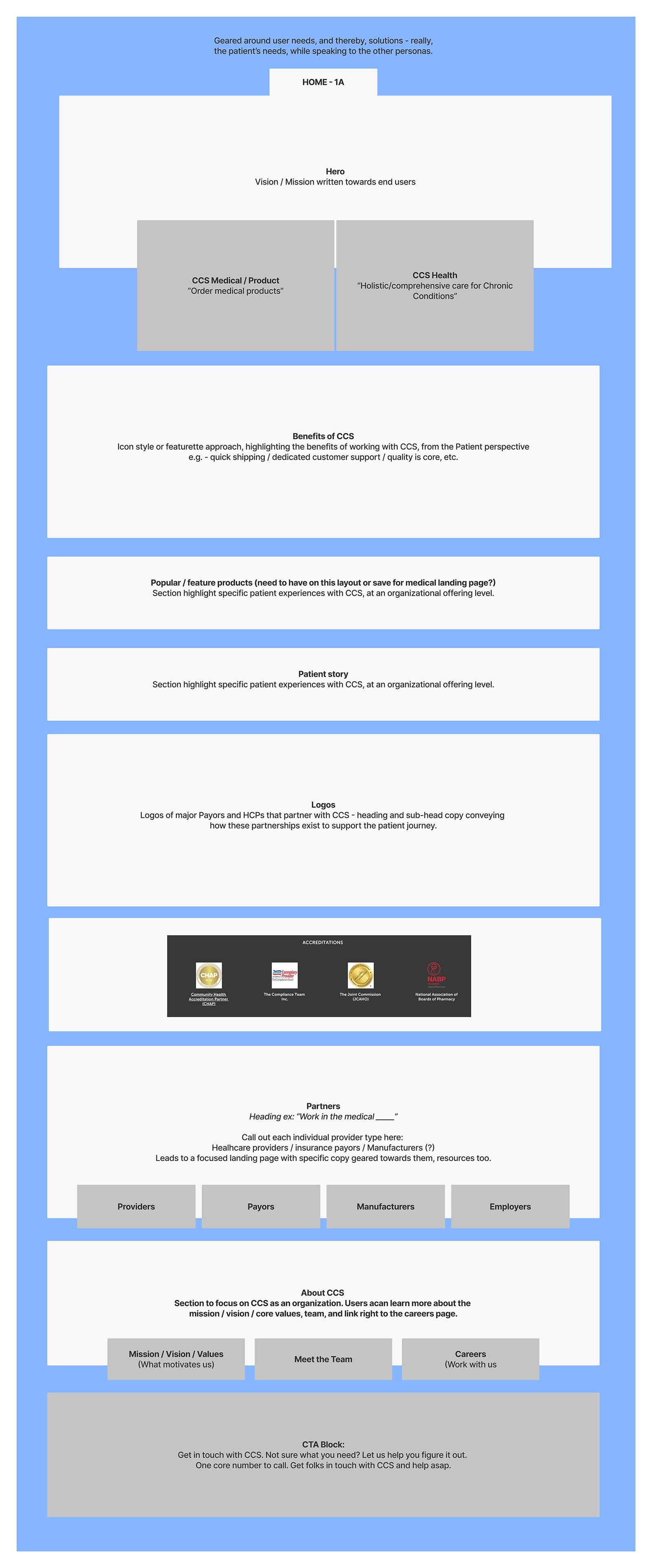
Core to this project were stakeholder and partner interviews. Working with SVPs, VPs, and other leadership, we developed a keen understanding of user types and how they utilized CCS’ products and services. (See some of the discovery work in the gallery below.)
The process was extensive as the relationship between CCS and its clients is complex.
Every decision in the content hierarchy throughout the site was made based on this Discovery phase. It set the foundation for the narrative and story told throughout the site, imagery, and eventually, the product.
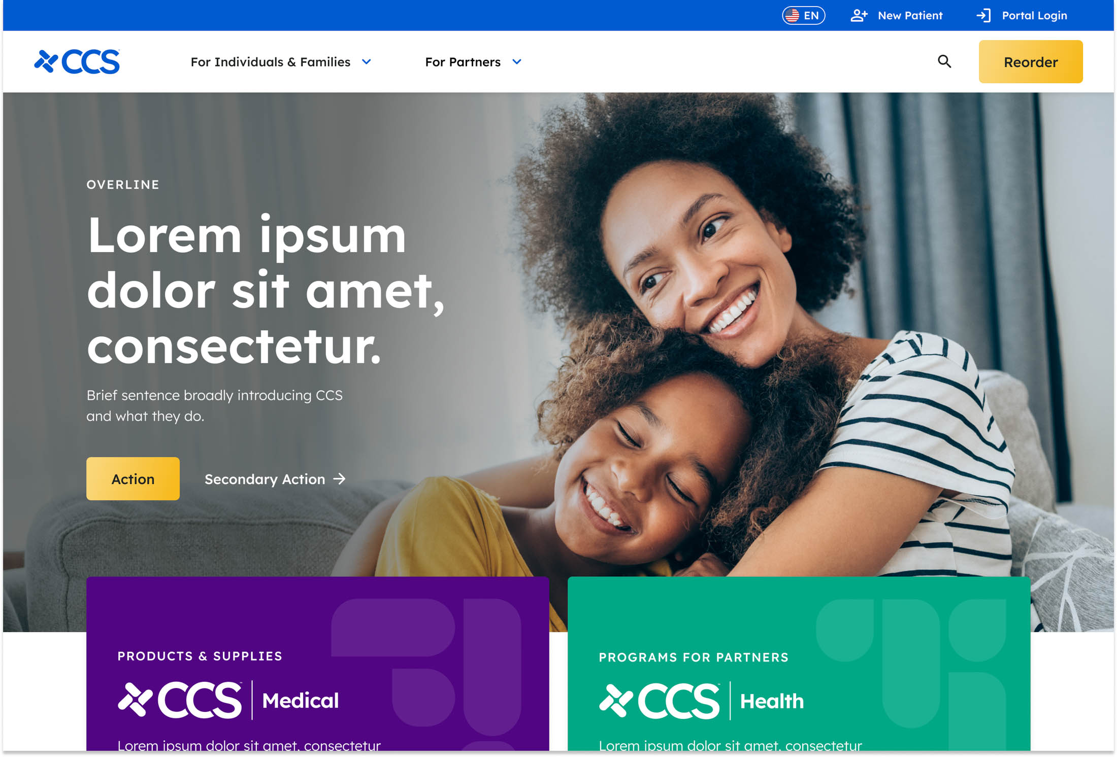
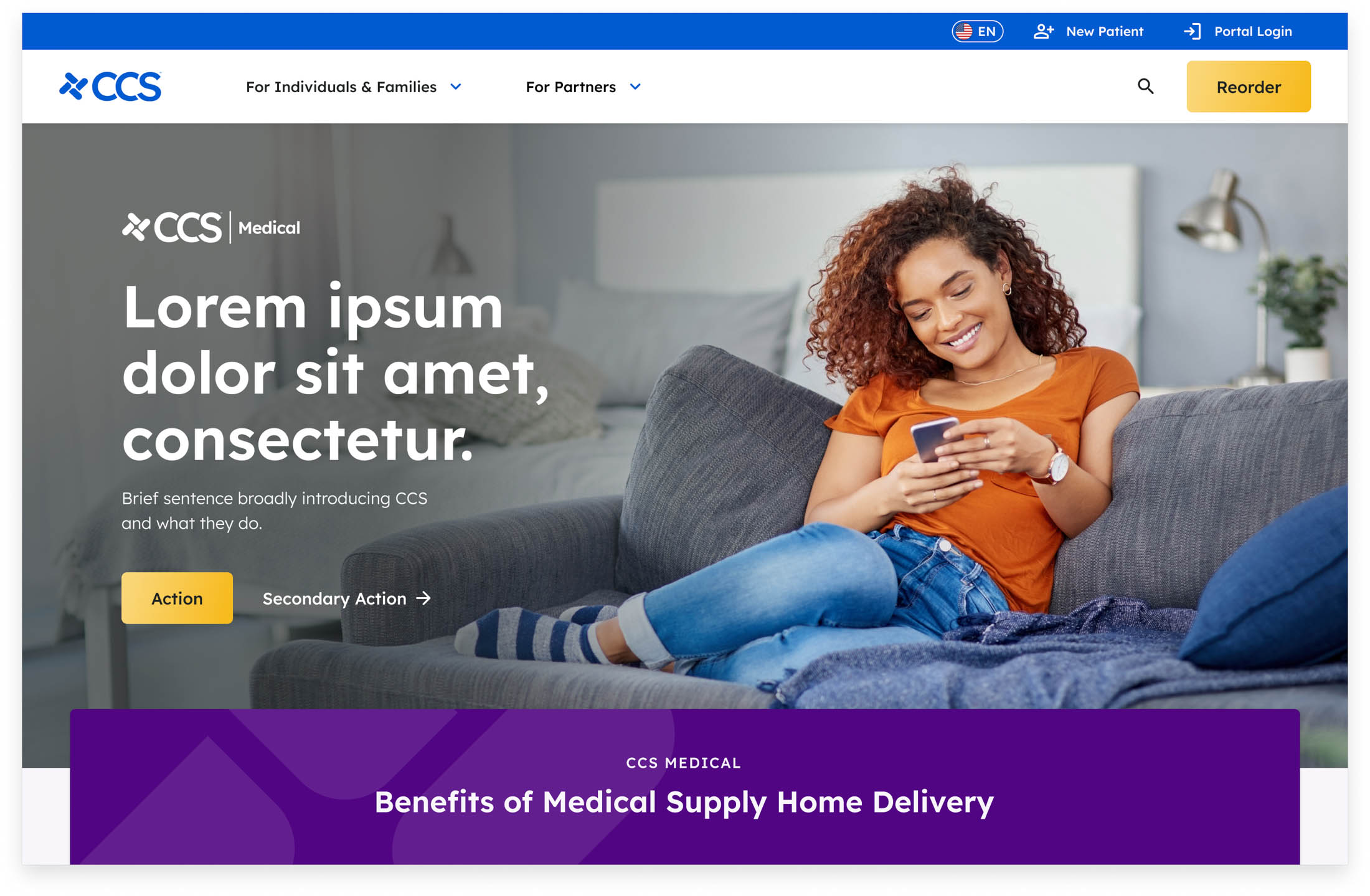
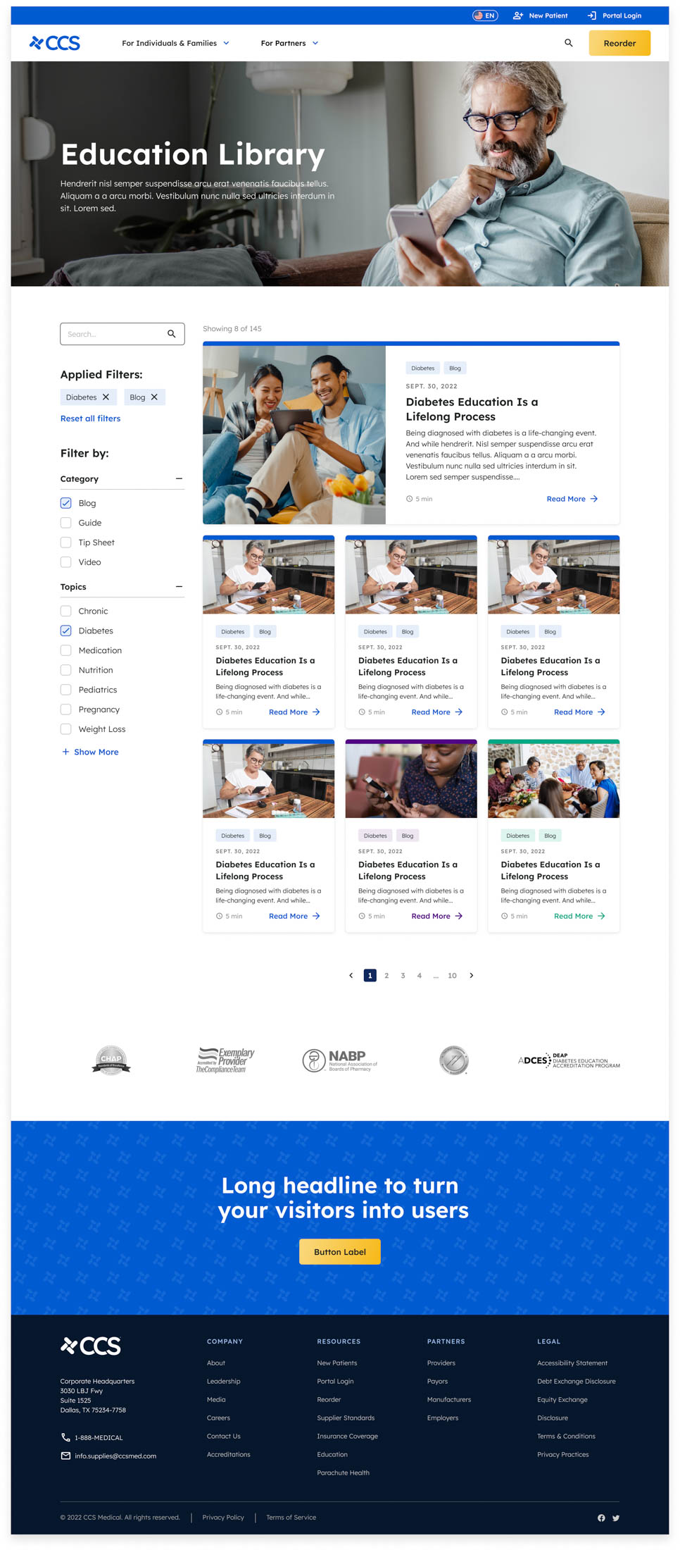
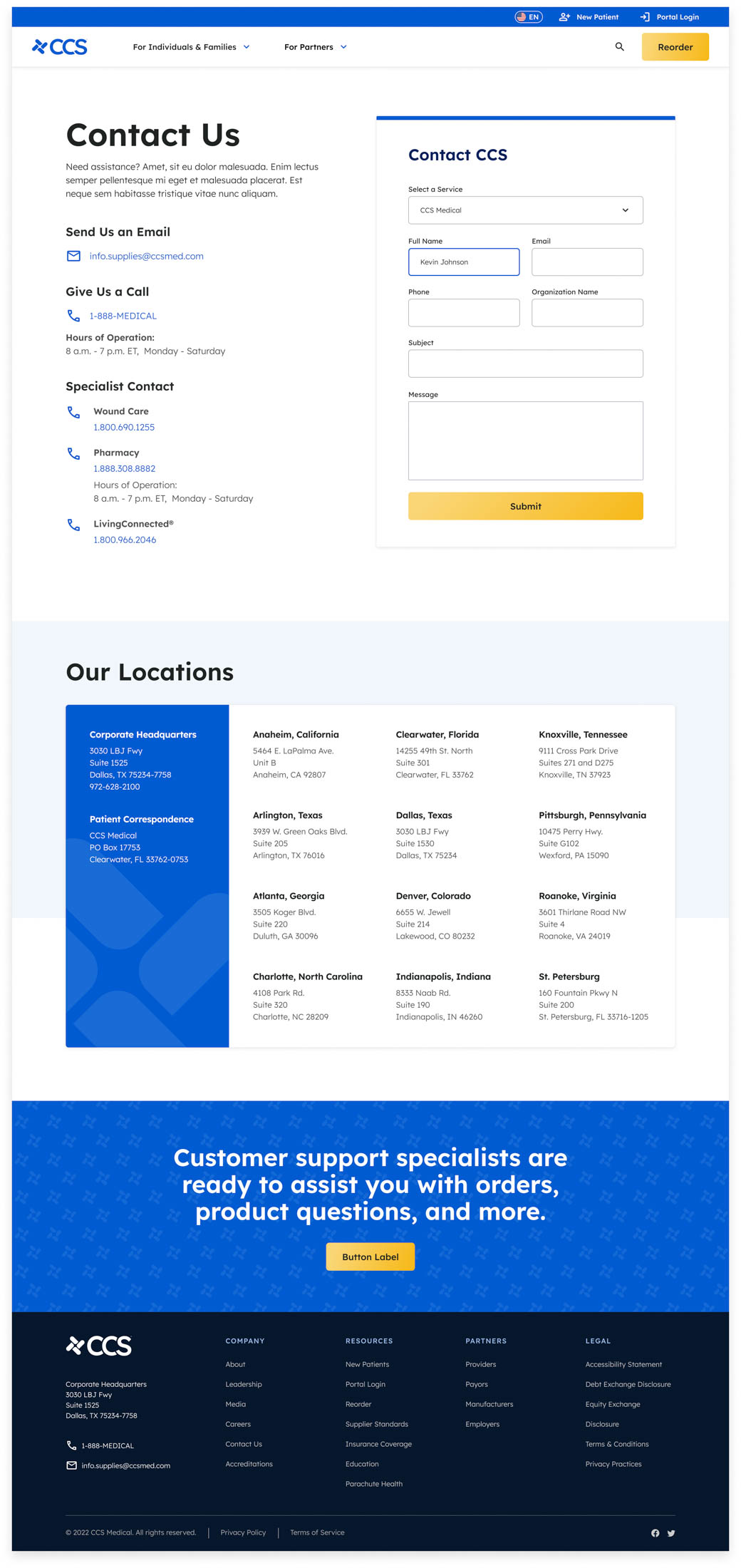
Moving into Design, we kept open and collaborative lines of communication with the CCS team. Exploratory stylescape (think a moodboard with some site elements like buttons / forms included), wireframes, and full hi-res mock-ups were part of the process.
My involvement
Personally, I lead all Product Discovery, crafting workshops to understand CCS and the needs of their end-users (Patients), along with leading interview workshops with stakeholders, and, individual interviews with partners of CCS (insurance companies like Humana, healthcare providers, and manufacturers like Abbott).
These workshops directly influenced content hierarchy, site and page narratives, and the sitemap. Each of these were part of my responsibility to create. The CCS team was a collaborator throughout this entire phase.
On this project, my role for Wireframing switched to providing direction and feedback (though, my content hierarchy closely resembles that of super-lofi wires).
From there, I provided Creative and UI direction as my Visual Designer set about branding the visual elements of the website (which, turned out beautifully!). Often, we’d collaborate on complex areas of the site, like the “ecomm without checkout” experience for CCS’ expansive product catalog.)
My involvement
- Product Design
- Creative Direction
- Design Thinking (Workshop leading)
- UX / UI
